1
Step 1
Start with KPIs
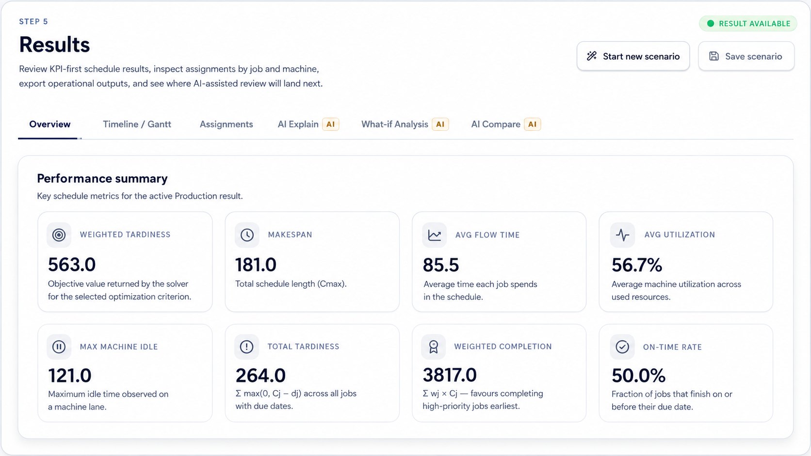
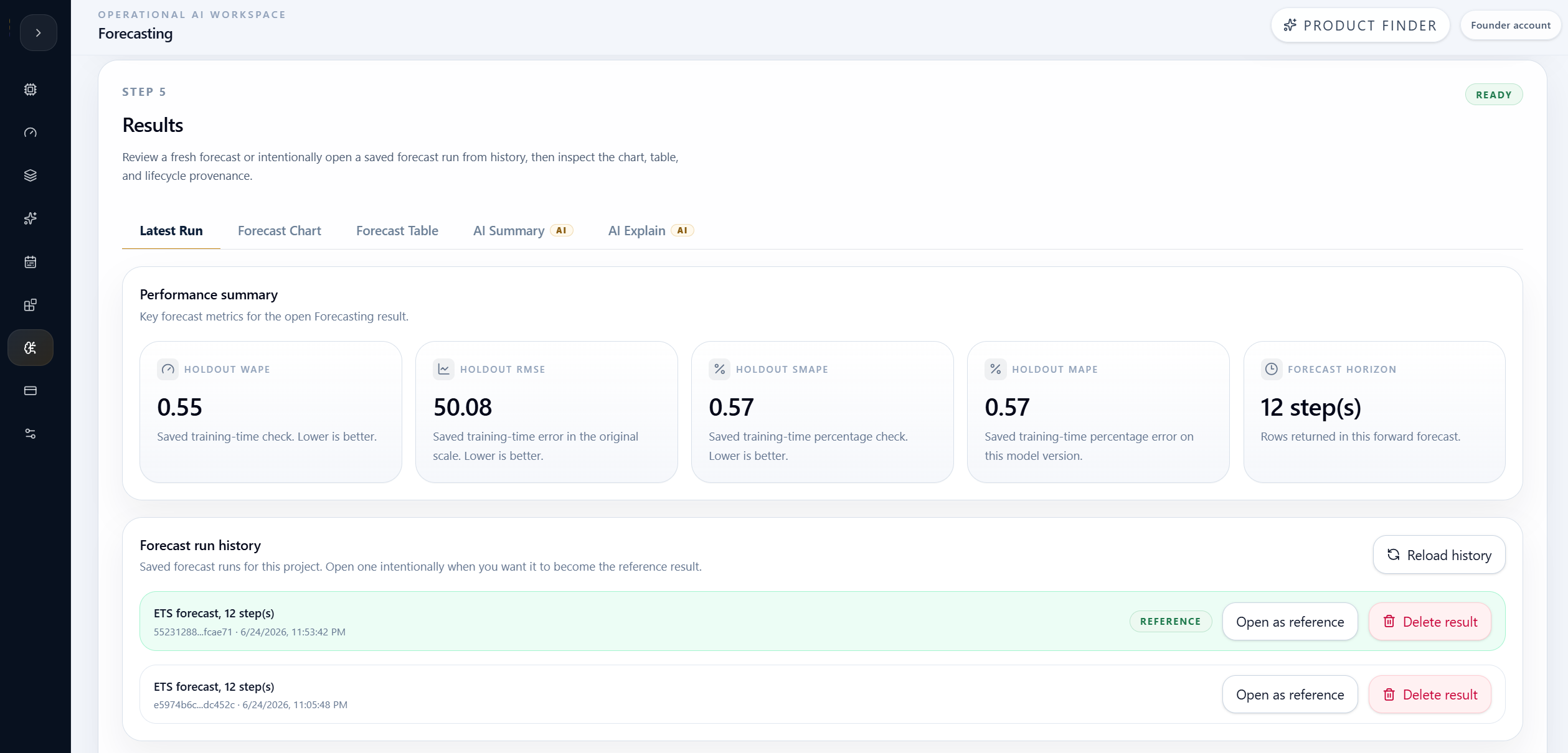
Use KPI cards to understand the result at a glance. Check whether each metric is better, worse, or needs more context.
Results and outputs How-To
Use metrics, charts, tables, and summaries to understand performance, compare outcomes, and identify important changes.
Guide details
Audience
Product users
Time
4 minutes
Category
Results and outputs
Use metrics, charts, tables, and summaries to understand performance, compare outcomes, and identify important changes.
Start with KPI cards
Read metric direction carefully
Use charts for patterns
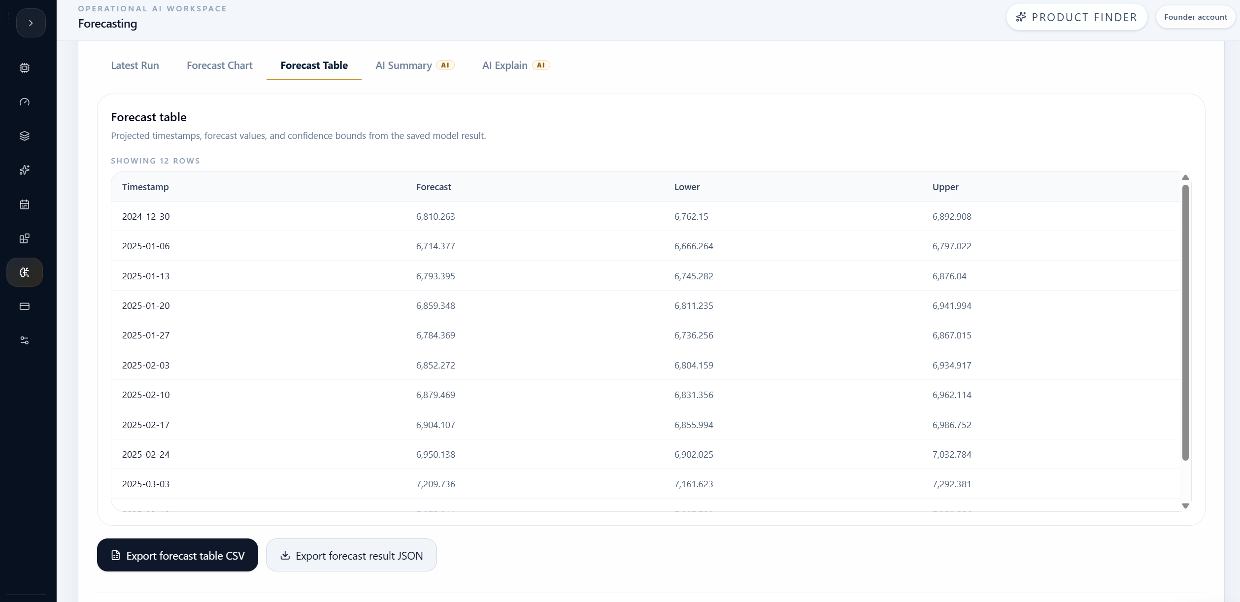
Use tables for record-level detail
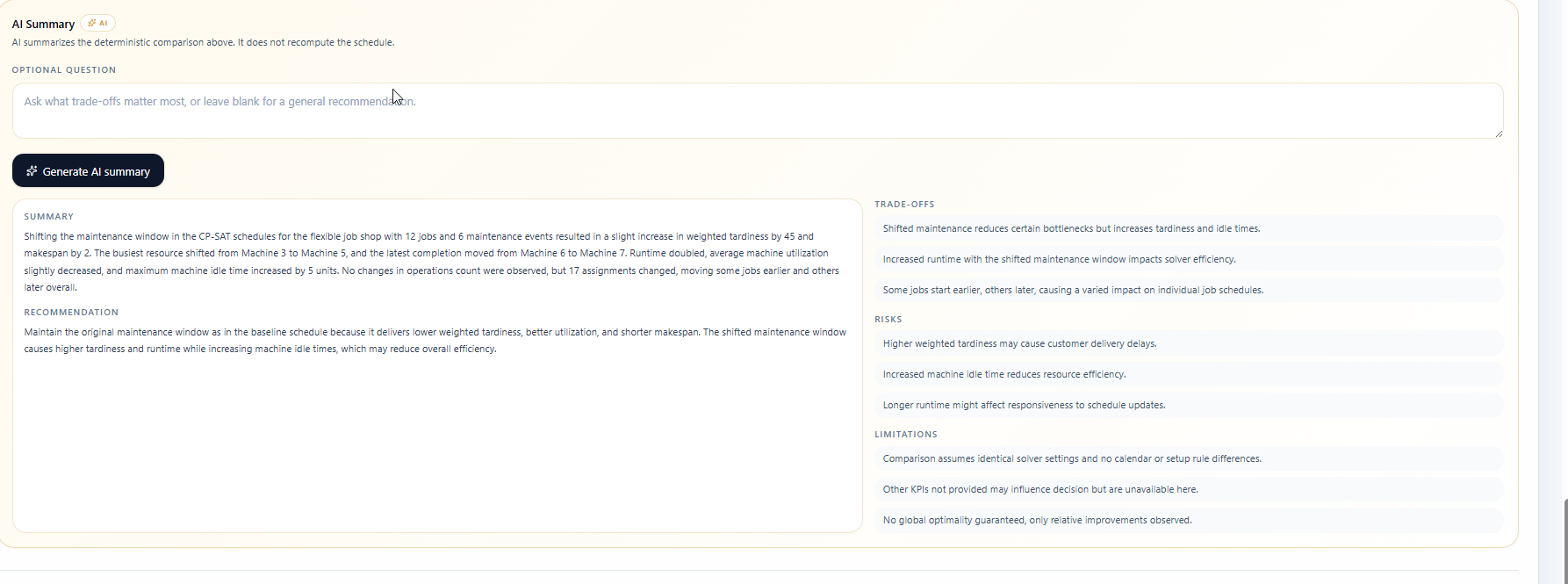
Confirm what changed before acting
Step by step
Each step gives you the action, the reason it matters, and the visual state to look for before continuing.
Step 1
Use KPI cards to understand the result at a glance. Check whether each metric is better, worse, or needs more context.
Step 2
Use charts to understand trends, distribution, demand, capacity, timing, or risk movement before drilling into rows.
Step 3
Use tables when you need the exact assignment, stop, row, forecast, anomaly, risk score, extracted field, or document evidence.
Step 4
Before deciding, confirm metric direction, units, filters, and whether lower or higher is better for the selected product.
Tips
Continue with nearby tasks in the same category.
Read the main result view, check the generated output, and understand whether the workflow produced a usable result.
Next
Return to the full how-to library or step back to the resource hub when you want a different kind of guide.